使用 css 实现居中效果方法汇总
介绍
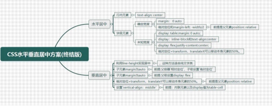
本章节主要汇总使用 css 实现居中效果方法(持续更新中)
使用教程
水平居中
文本对齐属性 (textAlign)
- 条件描述
- 行内元素
- 父元素添加
text-align: center;属性
- 代码示例
<!DOCTYPE html>
<html lang="en">
<head>
    <meta charset="UTF-8">
    <title>Title</title>
    <style>
        .parent {
            border: 1px solid;
            width: 100%;
            height: 100px;
            background-color: yellow;
        }
        .child {
            display: inline; /* 设置为行内元素,也可以直接使用行内标签 */            			border: 1px solid;
            background-color: green;
        }
        .next {
            text-align: center;
        }
    </style>
</head>
<body>
    <h3>测试前</h3>
    <div class="parent pre">
        <div class="child">child1</div>
    </div>
    <h3>测试后</h3>
    <div class="parent next">
        <div class="child">child1</div>
    </div>
</body>
</html>
外边距自动适应 (margin)
- 条件描述
- 块级元素
- 确定宽度 - 子元素宽度设置为
width: 50px; - 子元素外边距设置为
margin: 0 auto;
- 代码示例
<!DOCTYPE html>
<html lang="en">
<head>
    <meta charset="UTF-8">
    <title>Title</title>
    <style>
        .parent {
            border: 1px solid;
            width: 100%;
            height: 100px;
            background-color: yellow;
        }
        .child {
            display: block;
            border: 1px solid;
            width: 50px;
            background-color: green;
        }
        .next .child {
            margin: 0 auto;
        }
    </style>
</head>
<body>
    <h3>测试前</h3>
    <div class="parent pre">
        <div class="child">child1</div>
    </div>
    <h3>测试后</h3>
    <div class="parent next">
        <div class="child">child1</div>
    </div>
</body>
</html>
定位与外边距 (position)
- 条件描述
- 块级元素
- 确定元素宽度 -
width: 50px; - 父元素需要设置为相对定位 -
position: relative; - 子元素需要设置为绝对定位 -
position: absolute; left: 50%; - 子元素左外边距设置为该元素宽度的一半 -
margin-left: -25px;
- 代码示例
<!DOCTYPE html>
<html lang="en">
<head>
    <meta charset="UTF-8">
    <title>Title</title>
    <style>
        .parent {
            position: relative;
            width: 100%;
            height: 100px;
            border: 1px solid;
            background-color: yellow;
        }
        .child {
            display: block;
            width: 50px;
            height: 50px;
            border: 1px solid;
            background-color: green;
        }
        .next .child {
            position: absolute;
            left: 50%;
            margin-left: -25px; /* 目标元素的宽度为 50px */
        }
    </style>
</head>
<body>
    <h3>测试前</h3>
    <div class="parent pre">
        <div class="child">child1</div>
    </div>
    <h3>测试后</h3>
    <div class="parent next">
        <div class="child">child1</div>
    </div>
</body>
</html>
表格属性与外边距自动适应 (table)
- 条件描述
- 块级元素
- 未知宽度 - 子元素宽度未知
- 子元素设置为
display: table;(或者直接使用表格标签) - 子元素外边距设置为
margin: 0 auto;
- 代码示例
<!DOCTYPE html>
<html lang="en">
<head>
    <meta charset="UTF-8">
    <title>Title</title>
    <style>
        .parent {
            border: 1px solid;
            width: 100%;
            height: 100px;
            background-color: yellow;
        }
        .child {
            border: 1px solid;
            background-color: green;
        }
        .next .child {
            display: table;
            margin: 0 auto;
        }
    </style>
</head>
<body>
    <h3>测试前</h3>
    <div class="parent pre">
        <div class="child">child1</div>
    </div>
    <h3>测试后</h3>
    <div class="parent next">
        <div class="child">child1</div>
    </div>
</body>
</html>
内联块状与文本对齐属性 (inlineBlock)
- 条件描述
- 块级元素
- 未知宽度 - 子元素宽度未知
- 子元素设置为
display: inline-block; - 父元素设置为
text-align: center;
- 代码示例
<!DOCTYPE html>
<html lang="en">
<head>
    <meta charset="UTF-8">
    <title>Title</title>
    <style>
        .parent {
            border: 1px solid;
            width: 100%;
            height: 100px;
            background-color: yellow;
        }
        .child {
            border: 1px solid;
            background-color: green;
        }
        .next {
            text-align: center;
        }
        .next .child {
            display: inline-block;
        }
    </style>
</head>
<body>
    <h3>测试前</h3>
    <div class="parent pre">
        <div class="child">child1</div>
    </div>
    <h3>测试后</h3>
    <div class="parent next">
        <div class="child">child1</div>
    </div>
</body>
</html>
弹性布局 (flex)
- 条件描述
- 块级元素
- 未知宽度 - 子元素宽度未知
- 父元素设置为
display: flex;和justify-content: center;
- 代码示例
<!DOCTYPE html>
<html lang="en">
<head>
    <meta charset="UTF-8">
    <title>Title</title>
    <style>
        .parent {
            border: 1px solid;
            width: 100%;
            height: 100px;
            background-color: yellow;
        }
        .child {
            border: 1px solid;
            background-color: green;
        }
        .next {
            display: flex;
            justify-content: center;
        }
    </style>
</head>
<body>
    <h3>测试前</h3>
    <div class="parent pre">
        <div class="child">child1</div>
    </div>
    <h3>测试后</h3>
    <div class="parent next">
        <div class="child">child1</div>
    </div>
</body>
</html>
定位与移动 (css3)
- 条件描述
- 块级元素
- 未知宽度 - 子元素宽度未知
- 父元素设置为相对定位
position: relative; - 子元素设置为绝对定位
position: absolute;且left: 50%; - 子元素相对自身向左移动
tranform: translateX(-50%);
- 代码示例
<!DOCTYPE html>
<html lang="en">
<head>
    <meta charset="UTF-8">
    <title>Title</title>
    <style>
        .parent {
            border: 1px solid;
            width: 100%;
            height: 100px;
            background-color: yellow;
        }
        .child {
            border: 1px solid;
            background-color: green;
        }
        .next {
            position: relative;
        }
        .next .child {
            position: absolute;
            left: 50%;
            transform: translateX(-50%);
        }
    </style>
</head>
<body>
    <h3>测试前</h3>
    <div class="parent pre">
        <div class="child">child1</div>
    </div>
    <h3>测试后</h3>
    <div class="parent next">
        <div class="child">child1</div>
    </div>
</body>
</html>
垂直居中
设置行高(lineHeight)
- 条件描述
- 一般适用于纯文本类
- 子元素设置高度
height: 50px; - 子元素设置行高
line-height: 50px; - 子元素内的文本相对子元素垂直方向居中
- 代码示例
<!DOCTYPE html>
<html lang="en">
<head>
    <meta charset="UTF-8">
    <title>Title</title>
    <style>
        .parent {
            border: 1px solid;
            width: 100%;
            height: 100px;
            background-color: yellow;
        }
        .child {
            border: 1px solid;
            background-color: green;
        }
        .next .child {
            height: 50px;
            line-height: 50px;
        }
    </style>
</head>
<body>
    <h3>测试前</h3>
    <div class="parent pre">
        <div class="child">child1</div>
    </div>
    <h3>测试后</h3>
    <div class="parent next">
        <div class="child">child1</div>
    </div>
</body>
</html>
定位与外边距
- 条件描述
- 父元素设置为相对定位
position: relative; - 子元素设置为绝对定位
position: absolute; 和 方向 top: 0; bottom: 0; - 子元素上下外边距设置为
margin: auto; - 子元素设置宽高,否则外边距设置将无效
- 代码示例
<!DOCTYPE html>
<html lang="en">
<head>
    <meta charset="UTF-8">
    <title>Title</title>
    <style>
        .parent {
            border: 1px solid;
            width: 100%;
            height: 100px;
            background-color: yellow;
        }
        .child {
            border: 1px solid;
            background-color: green;
        }
        .next {
            position: relative;
        }
        .next .child {
            position: absolute;
            top: 0;
            bottom: 0;
            margin: auto;
            height: 50px; /* 子元素设置宽高, 否则 margin 自适应无效 */
        }
    </style>
</head>
<body>
    <h3>测试前</h3>
    <div class="parent pre">
        <div class="child">child1</div>
    </div>
    <h3>测试后</h3>
    <div class="parent next">
        <div class="child">child1</div>
    </div>
</body>
</html>
弹性布局与外边距
- 条件描述
- 父元素设置为
display: flex; - 子元素外边距
margin: auto 0;
- 代码示例
<!DOCTYPE html>
<html lang="en">
<head>
    <meta charset="UTF-8">
    <title>Title</title>
    <style>
        .parent {
            border: 1px solid;
            width: 100%;
            height: 100px;
            background-color: yellow;
        }
        .child {
            border: 1px solid;
            background-color: green;
        }
        .next {
            display: flex;
        }
        .next .child {
            margin: auto 0;
        }
    </style>
</head>
<body>
    <h3>测试前</h3>
    <div class="parent pre">
        <div class="child">child1</div>
    </div>
    <h3>测试后</h3>
    <div class="parent next">
        <div class="child">child1</div>
    </div>
</body>
</html>
弹性布局 (flex)
- 条件描述
- 父元素设置为
display: flex;且垂直方向align-items: center;
- 代码示例
<!DOCTYPE html>
<html lang="en">
<head>
    <meta charset="UTF-8">
    <title>Title</title>
    <style>
        .parent {
            border: 1px solid;
            width: 100%;
            height: 100px;
            background-color: yellow;
        }
        .child {
            border: 1px solid;
            background-color: green;
        }
        .next {
            display: flex;
            align-items: center;
        }
    </style>
</head>
<body>
    <h3>测试前</h3>
    <div class="parent pre">
        <div class="child">child1</div>
    </div>
    <h3>测试后</h3>
    <div class="parent next">
        <div class="child">child1</div>
    </div>
</body>
</html>
垂直对齐属性 (verticalAlign)
- 条件描述
- vertical-align 属性只能作用在 display 属性值为 inline、inline-block,inline-table 或 table-cell 的元素上
- vertical-align 属性设置元素的垂直对齐方式。该属性定义行内元素的基线相对于该元素所在行的基线的垂直对齐
- 浮动和绝对定位会让元素块状化,因此这两种情况也不会使 vertical-align 属性生效
- 代码示例
- 通过 table 与 table-cell 布局实现垂直居中效果
<!DOCTYPE html>
<html lang="en">
<head>
    <meta charset="UTF-8">
    <title>Title</title>
    <style>
        .parent {
            border: 1px solid;
            width: 100%;
            height: 100px;
            background-color: yellow;
        }
        .child {
            border: 1px solid;
            background-color: green;
        }
        .next {
            display: table;
        }
        .next .child {
            display: table-cell;
            vertical-align: middle;
        }
        .next .child .grandson {
            border: 1px solid;
            height: 50px;
            width: 50px;
            background-color: red;
        }
    </style>
</head>
<body>
    <h3>测试前</h3>
    <div class="parent pre">
        <div class="child">child1</div>
    </div>
    <h3>测试后</h3>
    <div class="parent next">
        <div class="child">
            <div class="grandson">grandson1</div>
        </div>
    </div>
</body>
</html>
table-cell 会导致宽度和高度的设置失效
- 嵌套三层元素,将目标元素放在 table-cell 的下一层
- 使用
display: table和display: table-row配合使用,然后再用display: table-cell设置单元格。这样可以让元素遵从表格的布局原则的同时还能设置宽高。
- 通过两个 inline-block 内联块级元素实现其中一个目标元素垂直居中效果
<!DOCTYPE html>
<html lang="en">
<head>
    <meta charset="UTF-8">
    <title>Title</title>
    <style>
        .parent {
            border: 1px solid;
            width: 100%;
            height: 100px;
            background-color: yellow;
        }
        .child {
            border: 1px solid;
            background-color: green;
        }
        .next {}
        .next .child {
           display: inline-block;
        }
        .next .child:last-child {
            visibility: hidden;
            border: none;
            width: 0;
            height: inherit;
            vertical-align: middle;
            background-color: blue;
        }
    </style>
</head>
<body>
    <h3>测试前</h3>
    <div class="parent pre">
        <div class="child">child1</div>
    </div>
    <h3>测试后</h3>
    <div class="parent next">
        <div class="child">child1</div>
        <div class="child">child2</div>
    </div>
</body>
</html>
定位与位移
- 条件描述
- 父元素设置为相对定位
position: relative; - 子元素设置为绝对定位
position: absolute;和top: 50%; - 子元素相对自身向上移动
transform: translateY(-50%);
- 代码示例
<!DOCTYPE html>
<html lang="en">
<head>
    <meta charset="UTF-8">
    <title>Title</title>
    <style>
        .parent {
            border: 1px solid;
            width: 100%;
            height: 100px;
            background-color: yellow;
        }
        .child {
            border: 1px solid;
            background-color: green;
        }
        .next {
            position: relative;
        }
        .next .child {
            position: absolute;
            top: 50%;
            transform: translateY(-50%);
        }
    </style>
</head>
<body>
    <h3>测试前</h3>
    <div class="parent pre">
        <div class="child">child1</div>
    </div>
    <h3>测试后</h3>
    <div class="parent next">
        <div class="child">child1</div>
    </div>
</body>
</html>
水平垂直居中
定位与外边距
- 条件描述
- 宽高固定
- 父元素设置为相对定位
- 子元素设置为绝对定位
- 代码示例
- 外边距自动适应,即:
margin: auto;
<!DOCTYPE html>
<html lang="en">
<head>
    <meta charset="UTF-8">
    <title>Title</title>
    <style>
        .parent {
            border: 1px solid;
            width: 100%;
            height: 100px;
            background-color: yellow;
        }
        .child {
            border: 1px solid;
            background-color: green;
        }
        .next {
            position: relative;
        }
        .next .child {
            position: absolute;
            left: 0;
            top: 0;
            right: 0;
            bottom: 0;

            width: 50px;
            height: 50px;

            margin: auto;
        }
    </style>
</head>
<body>
    <h3>测试前</h3>
    <div class="parent pre">
        <div class="child">child1</div>
    </div>
    <h3>测试后</h3>
    <div class="parent next">
        <div class="child">child1</div>
    </div>
</body>
</html>
- 外边距是宽高的一半
<!DOCTYPE html>
<html lang="en">
<head>
    <meta charset="UTF-8">
    <title>Title</title>
    <style>
        .parent {
            border: 1px solid;
            width: 100%;
            height: 100px;
            background-color: yellow;
        }
        .child {
            border: 1px solid;
            background-color: green;
        }
        .next {
            position: relative;
        }
        .next .child {
            position: absolute;
            left: 50%;
            top: 50%;

            width: 50px;
            height: 50px;

            margin-left: -25px;
            margin-top: -25px;
        }
    </style>
</head>
<body>
    <h3>测试前</h3>
    <div class="parent pre">
        <div class="child">child1</div>
    </div>
    <h3>测试后</h3>
    <div class="parent next">
        <div class="child">child1</div>
    </div>
</body>
</html>
弹性布局
- 条件描述
- 父元素设置为
display: flex;justify-content: center;align-items: center;
- 代码示例
<!DOCTYPE html>
<html lang="en">
<head>
    <meta charset="UTF-8">
    <title>Title</title>
    <style>
        .parent {
            border: 1px solid;
            width: 100%;
            height: 100px;
            background-color: yellow;
        }
        .child {
            border: 1px solid;
            background-color: green;
        }
        .next {
            display: flex;
            justify-content: center;
            align-items: center;
        }
	</style>
</head>
<body>
    <h3>测试前</h3>
    <div class="parent pre">
        <div class="child">child1</div>
    </div>
    <h3>测试后</h3>
    <div class="parent next">
        <div class="child">child1</div>
    </div>
</body>
</html>
定位与位移
- 代码示例
<!DOCTYPE html>
<html lang="en">
<head>
    <meta charset="UTF-8">
    <title>Title</title>
    <style>
        .parent {
            border: 1px solid;
            width: 100%;
            height: 100px;
            background-color: yellow;
        }
        .child {
            border: 1px solid;
            background-color: green;
        }
        .next {
            position: relative;
        }
        .next .child {
            position: absolute;
            left: 50%;
            top: 50%;

            transform: translateX(-50%) translateY(-50%);
        }
    </style>
</head>
<body>
    <h3>测试前</h3>
    <div class="parent pre">
        <div class="child">child1</div>
    </div>
    <h3>测试后</h3>
    <div class="parent next">
        <div class="child">child1</div>
    </div>
</body>
</html>